
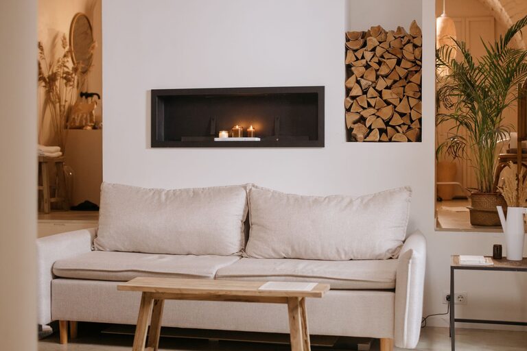
Why Calm Colors Matter
The colors in your home can influence how a room feels. Soft, balanced shades often create a sense of comfort and order, making spaces feel more welcoming and restful. Calm colors do not have to be plain or boring. With the right combination of tones, textures, and accents, they can add warmth, personality, and style.
Calm color schemes usually include muted versions of blue, green, beige, gray, white, and earthy tones. These shades are gentle on the eyes and work well in rooms where you want to relax, focus, or spend time with family.
The best color choices depend on your home, lighting, furniture, and personal preferences. Use the following tips to create a peaceful look that feels natural and easy to live with.
Start With the Mood You Want
Before choosing paint or accessories, think about how you want each room to feel. A bedroom may benefit from soft, restful colors, while a living room may need warmer tones that encourage conversation and comfort.
Consider these common color moods:
- Soft blue: Light blue can create an airy, peaceful feeling.
- Muted green: Green brings a natural quality to a space and pairs well with wood.
- Warm beige: Beige adds comfort and works with many decorating styles.
- Soft gray: Gray offers a clean, modern look without feeling too bright.
- Warm white: Creamy white can make a room feel open while maintaining a cozy atmosphere.
- Earthy brown: Light brown and tan add grounding warmth when used carefully.
Try describing the feeling you want in three words, such as peaceful, warm, and simple. This will help you avoid colors that look attractive alone but do not suit the overall mood.
Pay Attention to Natural Light
Lighting can change the appearance of any color. A shade that looks soft and warm in a store may appear cooler or darker at home. Before making a final decision, observe how the room receives light throughout the day.
Rooms with plenty of sunlight can handle cooler colors, such as pale blue or gentle gray. These shades can balance the warmth created by direct sunlight. Rooms with limited natural light may feel more comfortable with warm whites, beige, light tan, or muted peach.
Also consider the direction of the windows. Rooms with morning light may look different from rooms with afternoon or evening light. Test color samples on more than one wall and view them at different times.
Always Test Samples
Paint a small section of the wall or place large sample boards around the room. Look at the samples beside flooring, furniture, curtains, and trim. A color can change depending on the surrounding materials.
Small paper swatches are useful for comparing options, but they may not show the full effect of a color. Larger samples give you a better idea of how the shade will look across an entire wall.
Choose a Simple Base Color
A calm home often begins with a flexible base color. This is the main shade used on walls or in larger areas. Good base colors include warm white, light beige, pale gray, soft taupe, and muted green.
Choose a base color that works with the features you already have, such as floors, cabinets, countertops, and large furniture. If your home has warm wood floors, a soft beige or warm white may create a balanced look. If your furniture includes black, white, or metal finishes, a gentle gray may work well.
Using one main color throughout connected spaces can also make your home feel more organized. You can then add small changes in tone to give each room its own character.
Build a Balanced Color Palette
A calm palette usually includes three types of colors:
- Dominant color: The main shade that covers the largest area, such as walls or large rugs.
- Supporting color: A complementary shade used on furniture, curtains, or smaller sections.
- Accent color: A stronger tone added through pillows, artwork, plants, or decorative objects.
For example, a palette might include warm white walls, light sage furniture, and muted terracotta accents. Another option could be soft gray walls, natural wood furniture, and dusty blue accessories.
Keeping the strongest color in small amounts helps the room remain calm. Accent colors should add interest without taking over the space.
Use Color in Layers
Calm rooms are not created with paint alone. Layering color through different materials makes a space feel comfortable and complete. Add gentle variations through rugs, cushions, blankets, curtains, artwork, and storage pieces.
You can use several related shades instead of matching everything exactly. A room with cream, beige, and light tan may feel more natural than a room where every item is the same color.
Texture also matters. Linen, cotton, wool, wood, woven baskets, and ceramic pieces can add depth to a quiet palette. These materials keep soft colors from looking flat.
Include Natural Elements
Natural materials often work well with calm colors. Wood adds warmth, while plants introduce fresh green tones. Stone, rattan, jute, and cotton can make a room feel relaxed and connected to nature.
You do not need many accessories. A wooden side table, a woven rug, or a few plants may be enough to bring balance to a neutral room.
Be Careful With Very Cool Colors
Cool colors can be calming, but too many blue or gray tones may make a room feel cold, especially when it has little sunlight. If you prefer cool shades, balance them with warm materials and details.
For instance, pair pale blue walls with wood furniture, cream textiles, or brass-colored lighting. Add warm white rather than a stark white to create a softer transition.
The same principle applies to gray. Choose a gray with warm undertones if you want a comfortable, welcoming effect. Compare several samples, since grays can vary from warm to cool.
Consider the Whole Home
Each room can have its own color, but the overall home usually feels more peaceful when the colors relate to one another. Choose a few shades that can appear in different rooms in varying amounts.
For example, soft beige may be the main wall color, muted green may appear in the living room and bedroom, and warm wood tones may connect the spaces. Repeating small details creates a smooth visual flow.
Open floor plans especially benefit from a connected palette. Instead of using a different bold color in every area, try using different shades from the same color family.
Refresh Slowly
You do not have to change an entire room at once. Start with small, flexible updates such as pillow covers, curtains, artwork, or a rug. This allows you to test a color before committing to paint or larger furniture.
If you are happy with the result, continue the color through additional details. A gradual approach can help you create a calm home without making the process overwhelming.
The most successful color choices are those that suit your space and feel comfortable over time. Pay attention to light, balance, texture, and the colors you already enjoy. With a thoughtful palette and a few natural accents, any home can feel more peaceful, welcoming, and easy to enjoy.